

Introduction
In this article, we are going to look at how to use CSS to position elements in a flexible way while doing a simple project.
pre-requisite
Before we start, you need to know a little bit about HTML, CSS, and how to work with VS code.
We will be using Vs code but you can choose your desired editor.
without further ado let's dive in and have some fun
Display Flex
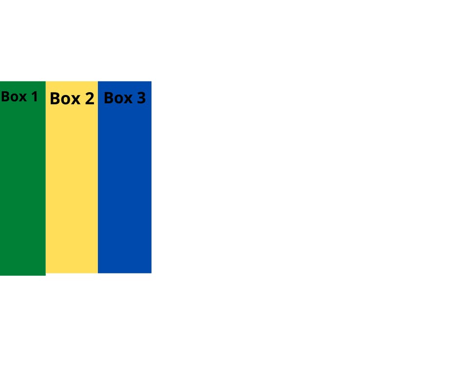
In order to start using the Flexbox model, you need to first define a flex container.
To do this we add a display property to the parent element and set its value to flex. let's do this practically:
Opening your Vs code
Create a folder named TwitterCard or name it whatever name you prefer
Create index.html & style.css files
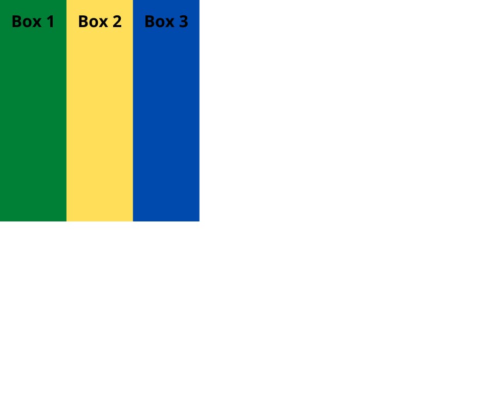
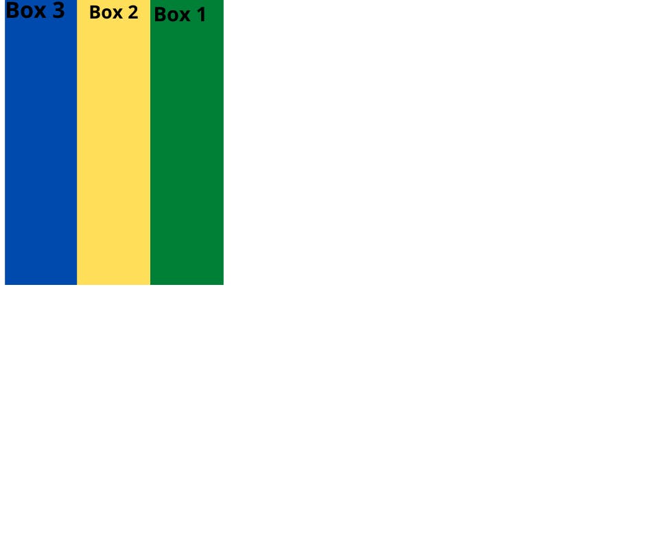
On the index.html file add the following code into the body
<div class="container">
    <div class="box-1"> Box 1 </div>
    <div class="box-2"> Box 2 </div>
    <div class="box-3"> Box 3 </div>
</div>
On the style.css file add the following code
* {
  padding: 0;
  margin: 0;
  box-sizing: border-box;
}

//parent container
.container{
  Display: flex;
  height: 100vh;
}

#box-1 {
  padding: 20px;
  width: 300px;
background-color: green;
}
#box-2 {
  padding: 20px;
  width: 300px;
  background-color: yellow;

}
#box-3 {
  padding: 20px;
  width: 300px;
 background-color: blue;
}
This causes the container to become a flex container and its children to become flex items.
FlexBox Architecture
Before you go further, let's first look at the flexbox architecture.
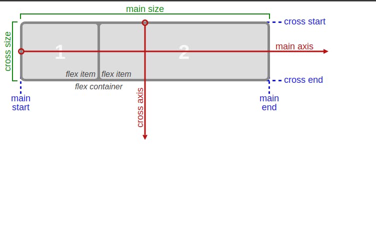
When you set an element to flex. the element became a flex container which makes it possible to align any children of that element into rows or columns. you achieve this by adding a flex-direction to the element, which we will talk about the property next.
The main axis above is the axis running in the direction the flex items are laid out. either row or column, and the start and end of this axis are called the main start and main end.
The cross axis is the axis running perpendicular to the direction the flex items are laid out in. The start and end of this axis are called the cross start and cross end.
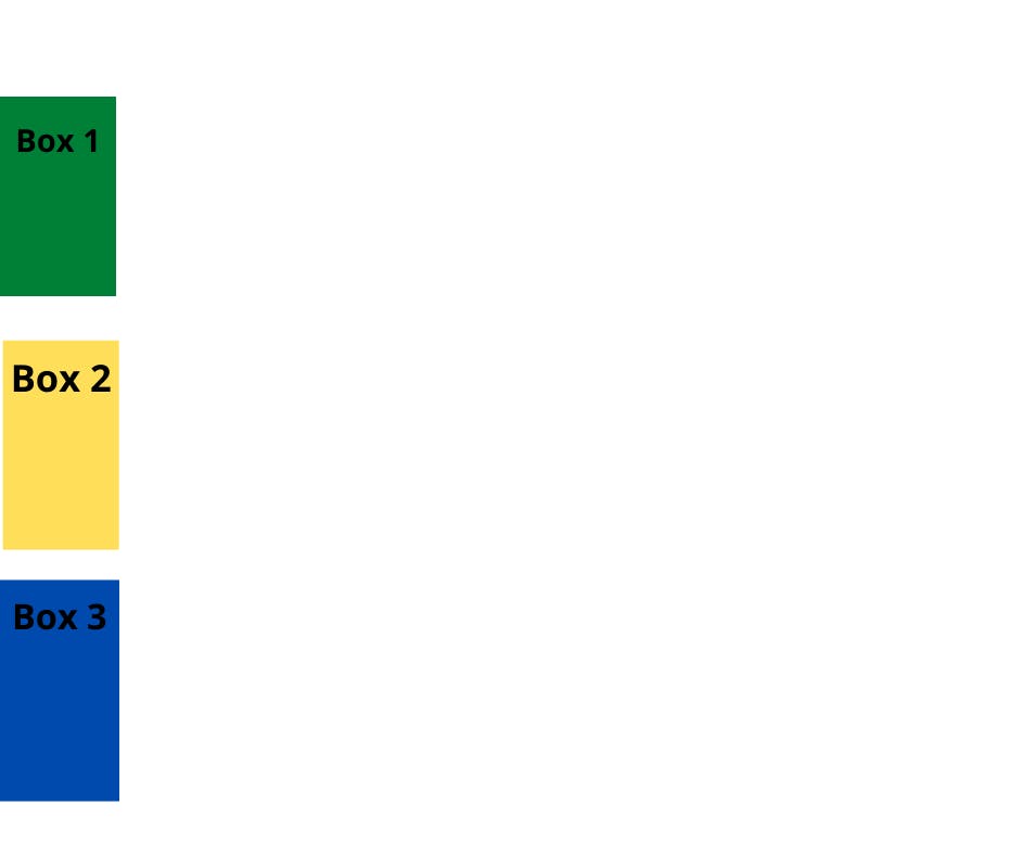
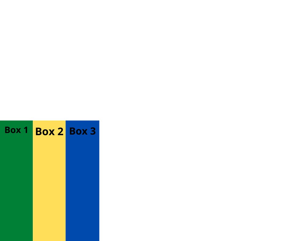
Flex-direction
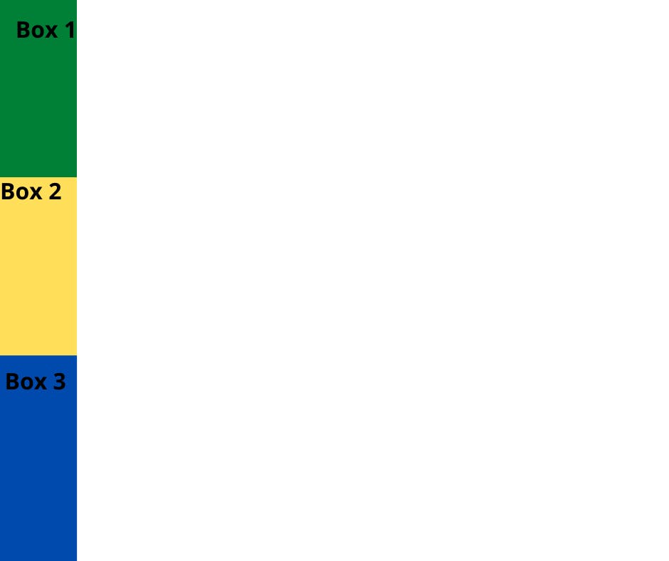
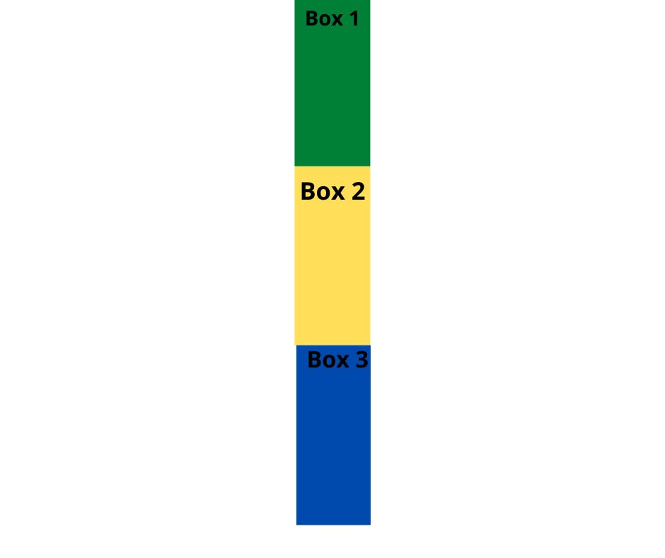
when you add flex-direction to a parent element. when you set the value to a row, it will align the children horizontally and when you set it to a column it will align the children vertically.
let's see that practically:
- Below place the items vertically
.container{
  Display: flex;
  flex-direction:column;
  height: 100vh;
}
.container{
  Display: flex;
  flex-direction:row;
  height: 100vh;
}
- The above code will result in default(horizontally)
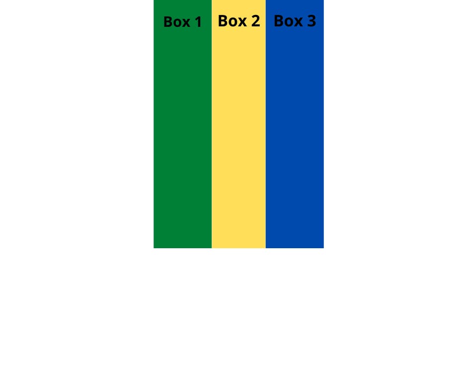
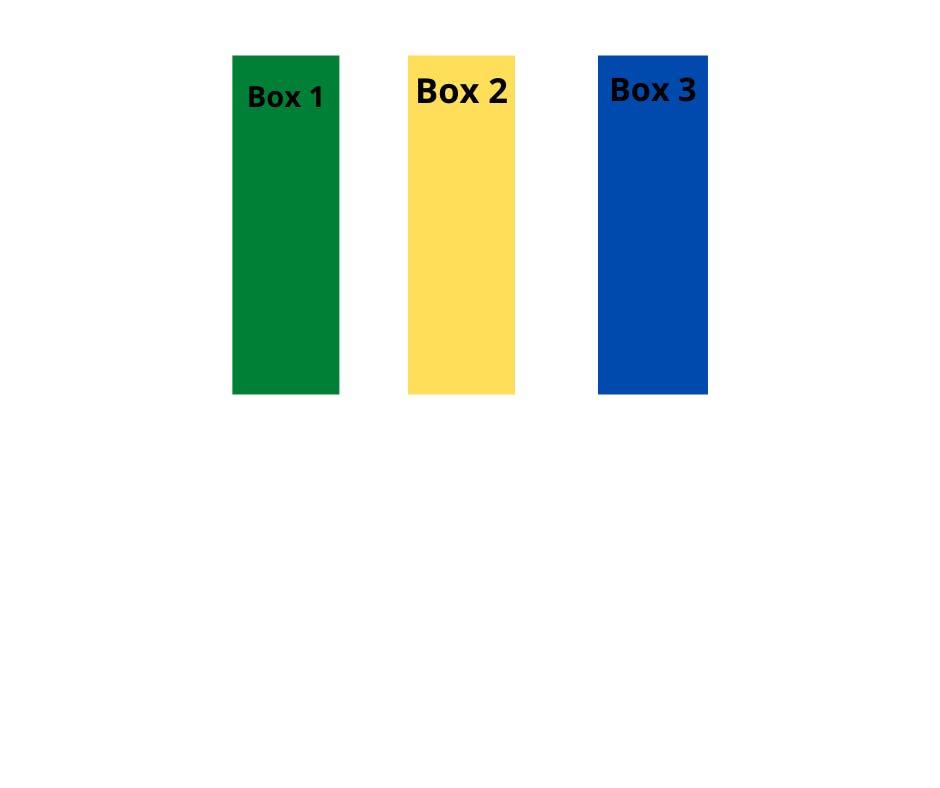
Justify-Content
This property is responsible for aligning and spacing out flex items along the MAIN AXIS inside the flex-container
Justify-content contains several values which are used to space items along the main axis:
- Center
when justify-content is set to center, the flex items are aligned center inside the flex container
.container{
  height: 100vh;
  display: flex;
  justify-content: center;
}
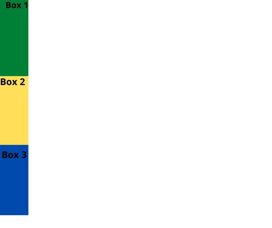
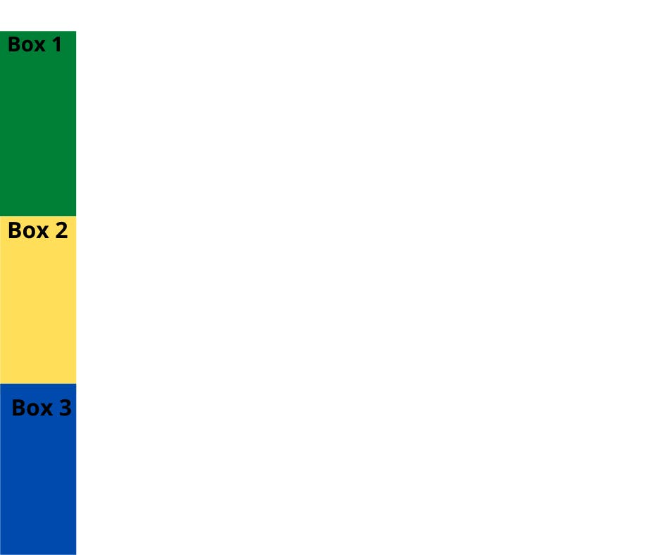
- Flex-start
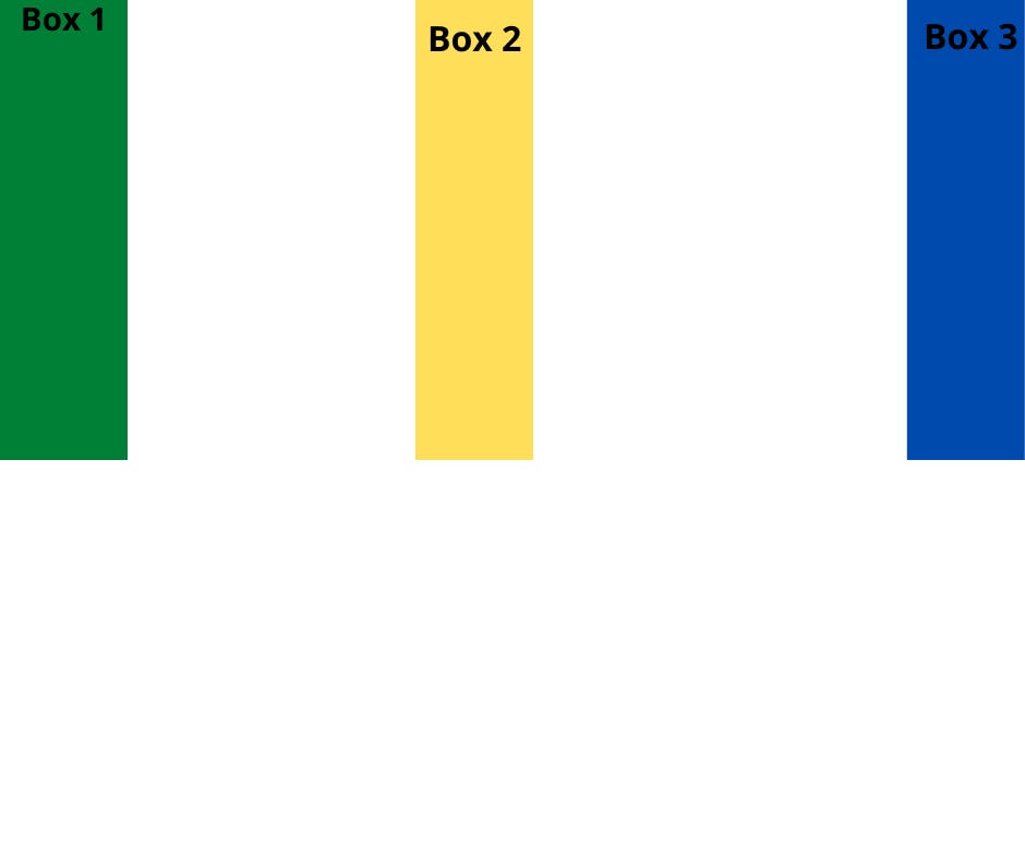
aligns items to the start of the flex container. For a row, this pushes the items to the left of the container. For a column, this pushes the items to the top of the container. This is the default alignment if no justify-content is specified.
For row:
.container{
  height: 100vh;
  display: flex;
  justify-content: flex-start;
}

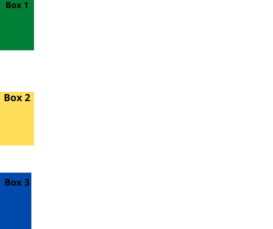
For column:
.container{
  height: 100vh;
  display: flex;
  flex-direction: column;
  justify-content: flex-start;
}
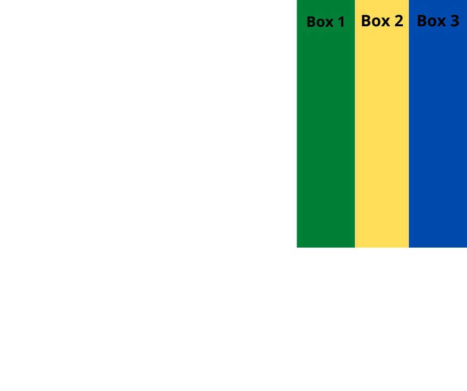
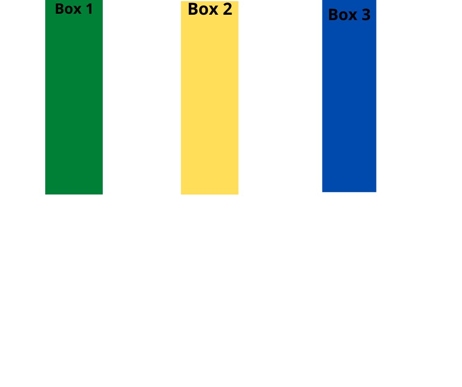
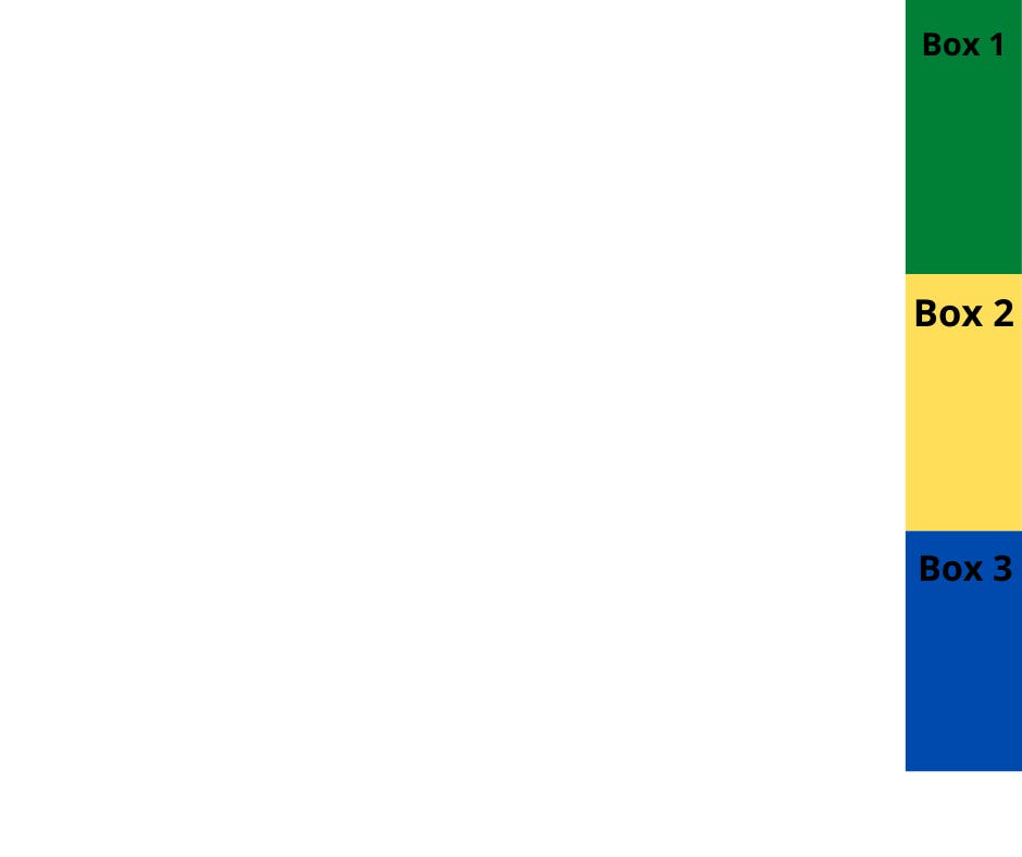
- Flex-end
this aligns items to the end of the flex container. For a row, this pushes the items to the right of the container. For a column, this pushes the items to the bottom of the container.
For row:
.container{
  height: 100vh;
  display: flex;
  justify-content: flex-end;
}
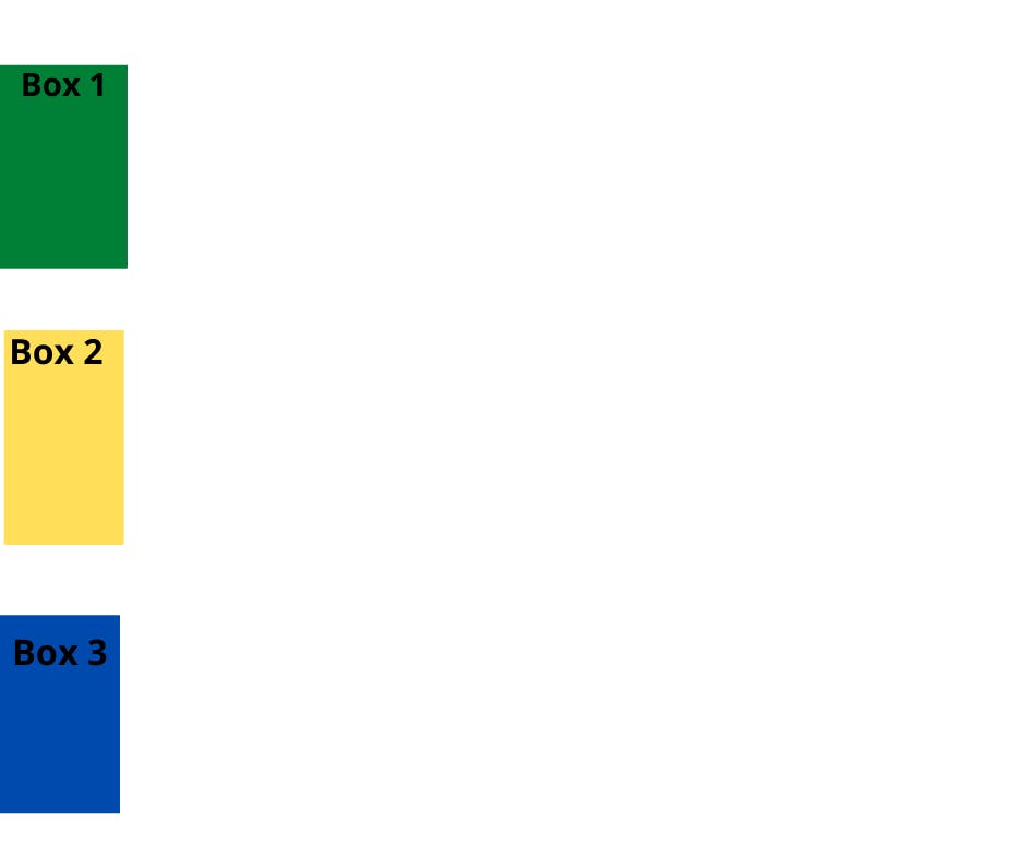
For column:
.container{
  height: 100vh;
  display: flex;
  flex-direction: column;
  justify-content: flex-end;
}
- Space-between
aligns items to the center of the main axis, with extra space placed between the items
For row:
.container{
  height: 100vh;
  display: flex;
  justify-content: space-between;
}
For column:
.container{
  height: 100vh;
  display: flex;
  flex-direction: column;
  justify-content: space-between;
}
- Space-around
Similar to space-between but with space-around, space is distributed around all the items with a half-space on either end of the flex container
For row:
.container{
  height: 100vh;
  display: flex;
  justify-content: space-around;
}
For column:
.container{
  height: 100vh;
  display: flex;
  flex-direction:column;
  justify-content: space-around;
}
space-evenly
space is distributed evenly between the flex items with a full space at either end of the flex container
For row:
.container{
  height: 100vh;
  display: flex;
  justify-content: space-evenly;
}
For column:
.container{
  height: 100vh;
  display: flex;
  flex-direction: column;
  justify-content: space-evenly;
}
Align-items
- This property is similar to justify-content. When you set the parent container to align items it arranges flex-items along the CROSS AXIS inside the flex container. like justify-content it also has different values available for aligning items along the cross axis. include:
Flex start
For a row:
This aligns items to the top of the container.
.container{
  height: 100vh;
  display: flex;
  align-items: flex-start;
}

For column:
This aligns items to the left of the container.
.container{
  height: 100vh;
  display: flex;
  flex-direction:column;
  align-items: flex-start;
}

- flex-end
For row:
this aligns items to the bottom of the container
.container{
  height: 100vh;
  display: flex;
  align-items: flex-end;
}
For column:
this aligns items to the right of the container
.container{
  height: 100vh;
  display: flex;
  flex-direction: column;
  align-items: flex-end;
}
- center
For row:
Gives equal space above and below the item vertically
.container{
  height: 100vh;
  display: flex;
  align-items: Center;
}
For column:
Gives equal space left and right of the item horizontally
.container{
  height: 100vh;
  display: flex;
  flex-direction: column;
  align-items: center;
}
- stretch
The value stretches the flex items to fill the container (this is the default). top-to-bottom.
.container{
  height: 100vh;
  display: flex;
  align-items: stretch;
}

baseline
align-items to their baselines. Baseline is a text concept, think of it as the line that the letters sit on.
flex - grow | shrink | wrap | basis
This property works whenever we resize the window
Flex-grow - grows the size of a flex item based on the width of the flex container.
Flex-shrink - The opposite of flex-growth, it shrinks based on the width of the flex container.
Flex-wrap - when you set a parent container to display flex, by default, all items will fit the parent container(either vertically or horizontally). flex-wrap gives you the ability to place the amount you want either vertically or horizontally.
For row:
.container{
  height: 100vh;
  display: flex;
  flex-wrap: wrap;
}
For column:
.container{
  height: 100vh;
  display: flex;
 flex-direction:column;
  flex-wrap: wrap;
}
Flex-basis - This is similar to adding width to a flex-item, but only more flexible.
Short-hand
flex - It is a shorthand to flex-grow, flex-shrink, and flex-basis combined.
.box-2{
    flex : 2 1 30em;
}
flex-flow - Short hand to flex-direction & flex-wrap
.container{
    flex-flow : row wrap;
}
place-content - This is the shorthand of justify-content & align-content
Order and align-self property
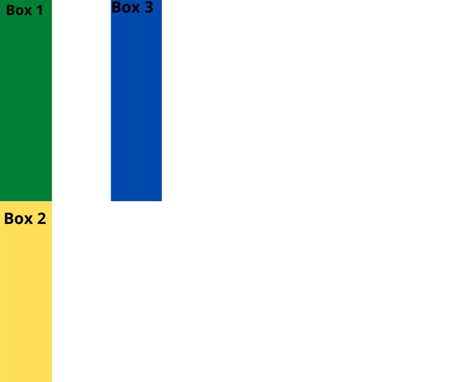
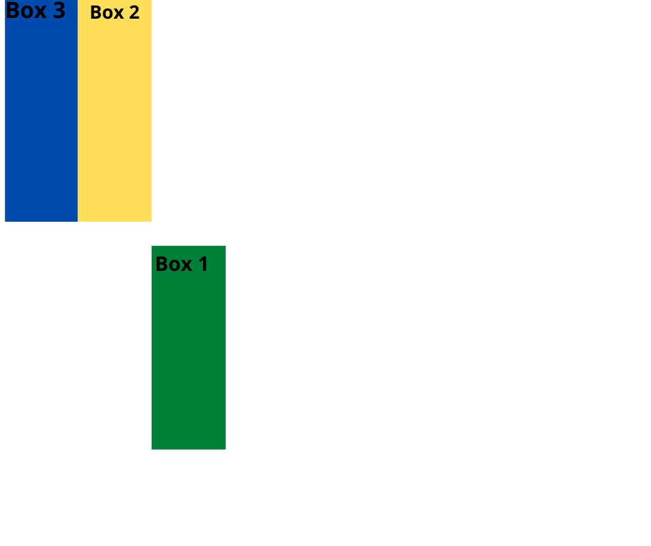
- Order
You can tell CSS how you want the order of flex items to appear in the flex container, using the order property.
You do this by adding numbers as value to the property (to the children), like so:
#box-1 {
  width: 50px;
  height: 200px;
  background-color: green;
  order: 3;
}
#box-2 {
  width: 50px;
  height: 200px;
  background-color: yellow;
  order: 2;
}
#box-3 {
  width: 50px;
  height: 200px;
  background-color: blue;
  order: 1;
}
- Align-self property
This property allows you to adjust each item's alignment individually.
align-self accepts the same values as align-items and will override any value set by the align-items property.
#box-1 {
  width: 50px;
  height: 200px;
  background-color: green;
  order: 3;
 align-self:center;
}
Conclusion
This article is a reference to FreeCodeCamp
I hope it gives you an idea of how flexbox works and thank you for reading to the end.
Open for suggestions.