


Are you struggling to understand Position property like me? don't worry, in this article we are going to learn more about It in a simple way, hope it will be of benefit to you.
Html elements by default start on the left side of the layout which is referred to as block-level items, while inline items sit within surrounding content. This flow is called the normal flow of documents/ static positioning.
But with the CSS property, you can manipulate the default layout, to achieve the desired layout of your document, and without further ado, let's dive in and talk about how this can be possible.
Relative Positioning
When you set an element to the relative position, it allows you to specify how CSS should move it relative to the normal flow of the documents, you can achieve this by pairing it with CSS offsets, that is top, bottom, right, and left.
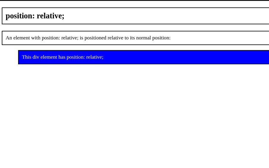
Setting an element as relative doesn't remove it from the normal flow of the documents, other elements around it act like it's still on the same spot.
Example
The following code changes the position of the targeted element to relative and moves it 50px away from the left
.relative {
  position: relative;
  left: 50px;
  background-color: blue;
  color: white;
}
Absolute positioning
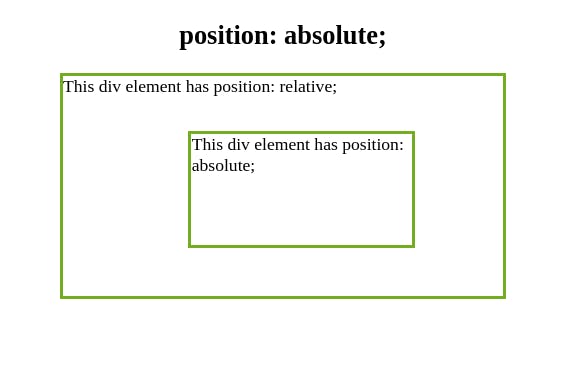
Unlike relative position, When you set an element to the absolute position it removes the element from the normal flow of the document, the surrounding items ignore it.
Also, an element with absolute position is positioned relative to the nearest positioned ancestor, it locks the element to its parent container, however, If you forget to add a position rule to the parent item, it uses the document body and moves along with page scrolling.
Example The following code changes the position of the targeted element to Absolute and moves it 50px away from the top and 80px away from the right.
.absolute {
  position: absolute;
  top: 50px;
  right: 80px;
  width: 200px;
  height: 100px;
  border: 3px solid #73ad21;
}
Fixed positioning
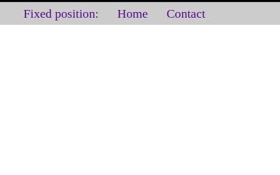
the fixed position is a type of absolute positioning that locks an element relative to the browser window/viewport, this means that it always stays in the same place even if the page is scrolled.
like absolute positioning, it's used with the CSS offset properties and also removes the element from the normal flow of the document, the difference between them is, with a fixed position, the element in position won't move when the user scrolls.
Example The following code changes the position of the navbar element to fixed and offsets 0 pixels from the top and 0 pixels from the left.
#navbar {
  position: fixed;
  top: 0;
  left: 0;
  width: 100%;
  background-color: rgba(0, 0, 0, 0.2);
}
Sticky position
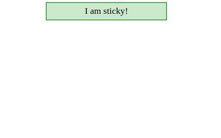
With sticky, an element is positioned according to the normal flow of the document, and then offset relative to its nearest scrolling ancestor/ user scroll position
A stick element is positioned relative until a given offset position is met in the viewport then it "sticks" or became fixed and this doesn't affect any other element's position.
Note some browser doesn't support it like Internet Explorer and others require a -WebKit- prefix to work like safari
Example
The following code changes the position of the targeted element to sticky, it sticks to the top of the page top: 0, when you reach its scroll position.
div {
  margin: auto;
  width: 200px;
  text-align: center;
  display: flex;
  justify-content: center;
  align-content: center;
}
div.sticky {
  position: -webkit-sticky;
  position: sticky;
  top: 0;
  padding: 5px;
  background-color: #cae8ca;
  border: 2px solid #4caf50;
}
Thank you for reading!
Let's connect Twitter